Wander Type Case Study
Researcher | Typographer | Book Designer | Visual Storyteller
Morelia, Michoacán, México is part of the Wander Type Project, which aims to reposition the underrepresented typography around the world.
-
✺
Typographic Research & Curation
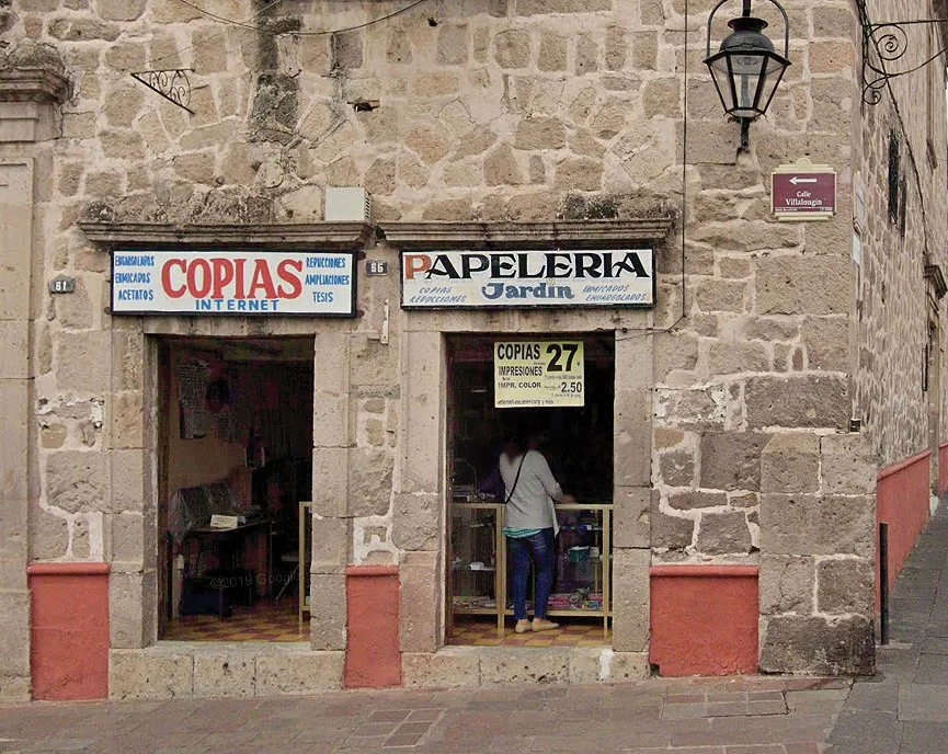
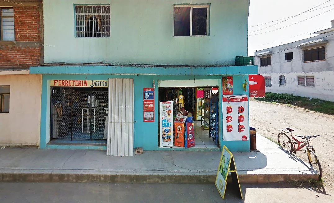
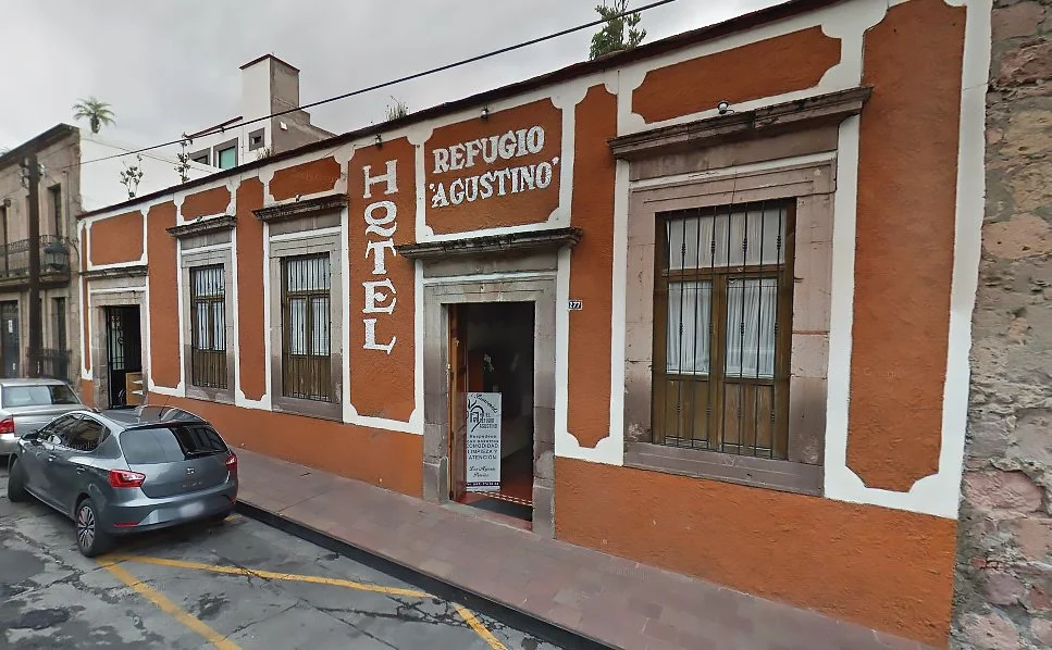
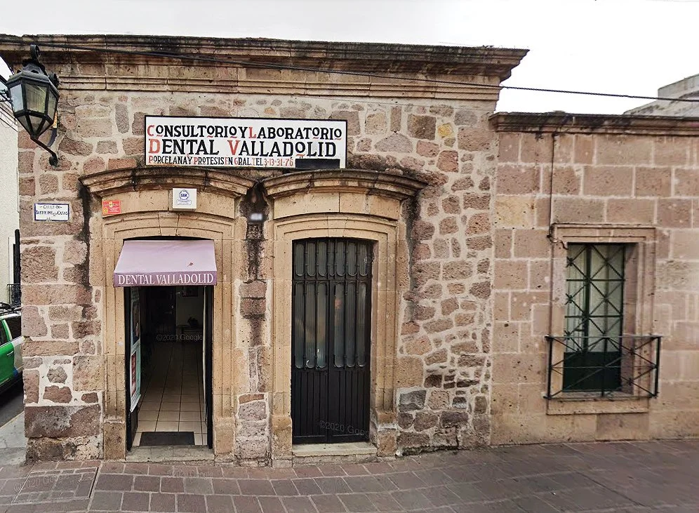
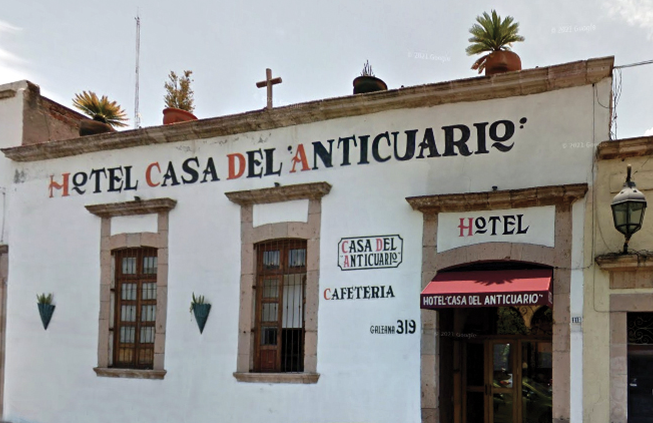
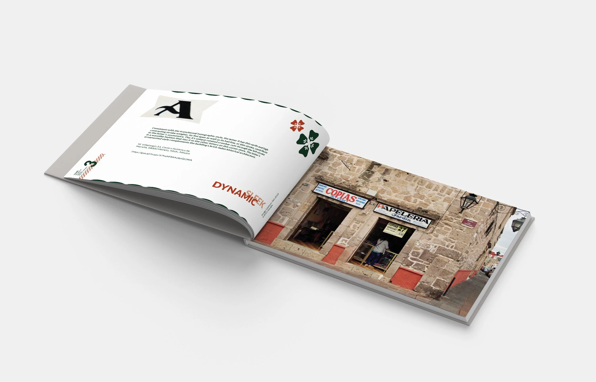
Virtually explored Morelia’s Historic Center using Google Maps Street View to document and analyze 28 hand-painted signs, each representing a letter of the Spanish alphabet. -
✺
Editorial Design & Layout
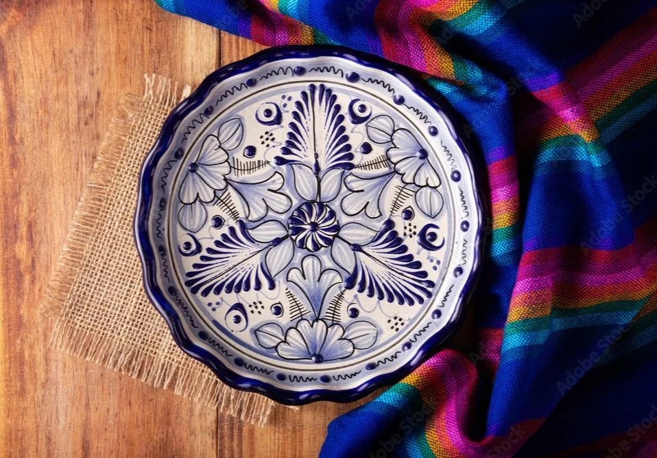
Designed the 74-page book including page structure, typography, and cover art inspired by traditional Talavera pottery, integrating design principles to ensure clarity and cultural sensitivity. -
✺
Content Organization & Visual Analysis
Compiled geographic coordinates, URLs, and letterform analyses for each featured sign, presenting the content in a cohesive and user-friendly format.

This 74-page book stemmed from a desire to explore the vernacular typography found throughout the streets of Morelia, the state capital of Michoacán, México

About this book.
A virtual exploration of Morelia’s streets—nearly 2,000 miles away—was conducted using Google Maps Street View to study the city’s vernacular typography. Twenty-eight hand painted signs were selected and curated after examining artisanal markets, businesses, and shops throughout the Historic Center.
The book pairs each letter of the Spanish alphabet with a selected street sign. Each page also includes the corresponding geographic location and an in-depth typographic analysis of the letterform.
The opening chapters explore common traits in Mexican typography, while the remaining sections focus on distinctive letterforms that don’t fit into any defined category.


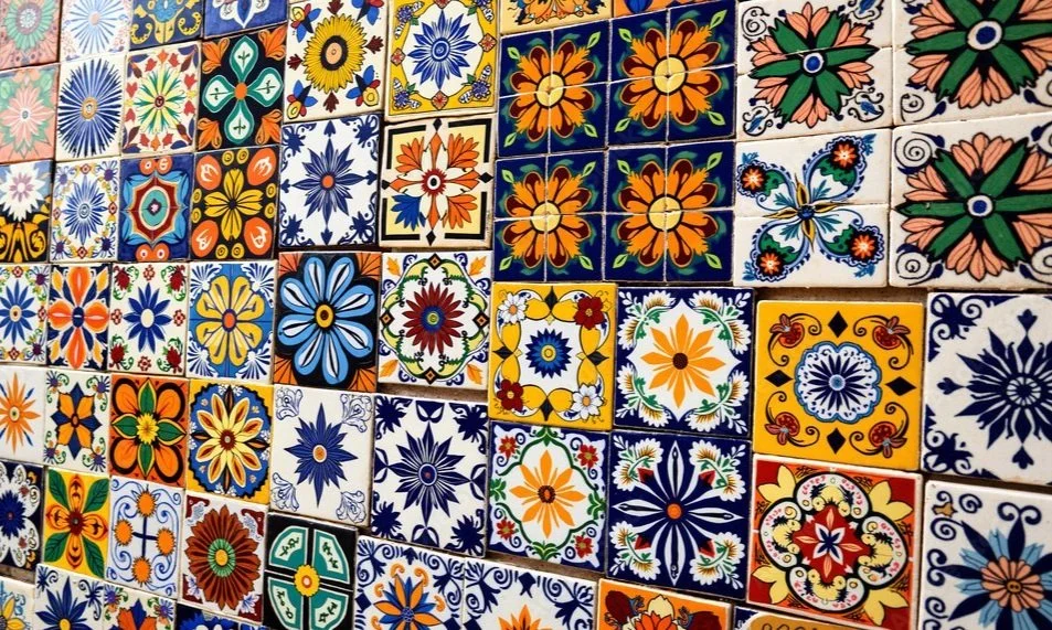
The creative direction was inspired by the vibrant patterns and colors of Mexican Talavera tiles, vintage street signage, and authentic culinary traditions.

A Journey into Morelia’s Hand-Painted Signs and Cultural Heritage
The front cover was inspired by Talavera. While this handmade Mexican and Spanish pottery style did not originate in Morelia, it portrays the country’s indigenous artistic legacy as a whole.


This project combined cultural research, typographic analysis, and editorial design. Each element—from the sign selection to the final layout—was developed to celebrate and preserve vernacular typography in Morelia, Michoacán, México.